
Configure contextual widgets
Widgets deliver a focused message without requiring a multistep guide. Start in the relevant collection, choose Create, select Build on page, and choose Open Editor. Use content and button controls for the message itself.
Choose behavior for the format
Section titled “Choose behavior for the format”Open Editor options → Behavior in the editor.
| Format | Important controls | Example |
|---|---|---|
| Anchored card | Placement, alignment, distance, pointer, and a target selected in the live editor. | Explain Export report beside that product control. |
| Toast | Position and Auto-dismiss milliseconds (blank disables). | Briefly announce an available resource without blocking work. |
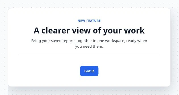
| Modal | Layout, Backdrop, opacity, and optional backdrop dismissal. | Explain an important product change. |
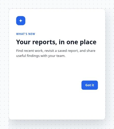
| Slideout | Edge position and optional backdrop controls. | Give a longer feature introduction from the side. |
| Banner | Banner position → Top / Bottom. Width is full. | Announce a maintenance window. |
| Hotspot | Beacon style, Beacon color, and a selected target. | Mark a new control with a beacon; clicking it opens the contextual card. |
| Cursor follower | Horizontal offset and Vertical offset. | Offer compact pointer-adjacent help in a desktop interaction. |
The Dismissible control governs whether users can close applicable widgets. Keep timed messages readable for long enough; 5,000 milliseconds means five seconds.

Attach an anchored card or hotspot
Section titled “Attach an anchored card or hotspot”Choose Open live editor, use Select to pick the actual element, and inspect the target’s live status. Test on the intended page and account state. The element must exist when the experience is delivered.
Avoid covering important controls
Section titled “Avoid covering important controls”Start with Automatic layering. If the widget is obscured, inspect layering in the real product before using relative or custom layering. Increasing a number cannot correct a wrong target or a page that does not match.
Verify and publish
Section titled “Verify and publish”Check the message, button destination/action, dismissal, and placement on desktop and mobile. Cursor-following behavior should be tested on a device with a pointer; choose a more appropriate format for a mobile task. Complete the shared audience and page settings, trigger, and publishing review.